IN THIS LESSON
Python Charts
We’ll use Jupyter notebooks in the Anaconda download to plot and chart data in python. Just go to the Anaconda navigator (the green circle we launched from the start bar) and click Launch under Jupyter notebook. Select Chrome or any web browser, this will show up in your Chrome browser for ex and allow you to navigate and build these “notebooks”. They are one of the most common ways of presenting and dealing with data among data science professionals for their ease of use, clarity, and helpful functions.
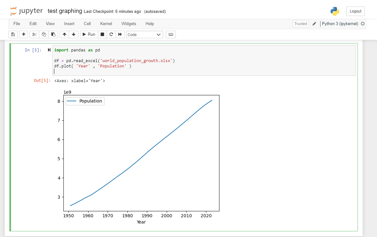
See the line of code on the right and click “Run” to execute the code and see the line chart graphed — further on what those lines of code represent will be explored in future lessons.
Code:
import pandas as pd
df = pd.read_excel('world_population_growth.xlsx')
df.plot( 'Year' , 'Population' )
Explanation:
The first line imports the pandas module to import and plot the data with built-in functionality. The second line reads in the world_population_growth.xlsx file taken from the Wikipedia page above and the final line actually creates a plot in the screenshot above in the jupyter notebook, telling the function to plot the “Year” column on the x axis and the “Population” column on the y axis. The formatting of the y axis is automatically applied to show a single number representing billions, and we’ll see in future lessons how to further edit the graph with customizations.
-
Add a short summary or a list of helpful resources here.
