Graphing Charts in Python
Python Charts
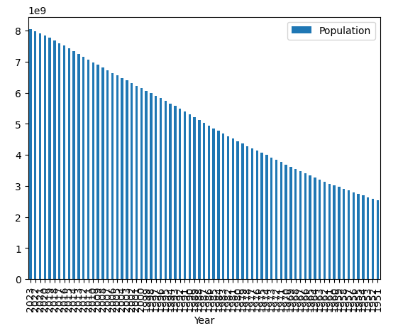
Now if you’d like a bar chart instead of a line chart, that’s very easy to switch in Python:
Code:
import pandas as pd
df = pd.read_excel('world_population_growth.xlsx')
ax = df.plot.bar( 'Year' , 'Population' )
Explanation:
Above we are using the “df.bar.plot()” function from pandas which is similar to the line chart setup. However, we’ve added the “.bar” to specify we’d like a bar chart, and set it to the “ax”, which is essentially a shortened form of specifying the “axes” we’re going to perform further updates to. Notice that the chart is reversed now, with the most recent year on the left, and the x axis labels are very close together — let’s fix that in the next lessons.
-
Add a short summary or a list of helpful resources here.
