Python Charts
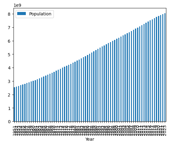
Let’s ensure that the data is going from left to right, as in the most recent year showing up on the right side of the graph with a small change:
Code:
import pandas as pd
df = pd.read_excel('world_population_growth.xlsx').sort_values('Year')
ax = df.plot.bar( 'Year' , 'Population' )
Explanation:
Here, we’re sorting our dataframe from our Excel spreadsheet before graphing it. In the Excel spreadsheet, the top rows in the sheet are the most recent years and by default, the bar chart in Python will take the topmost rows and graph them left to right in the chart space (corresponding to top to bottom in the Excel worksheet). The sort_values() function simply sorts the values so that the most recent year will show up at the end of the Excel spreadsheet.
-
Add a short summary or a list of helpful resources here.
