Graphing Charts in Python
Python Charts
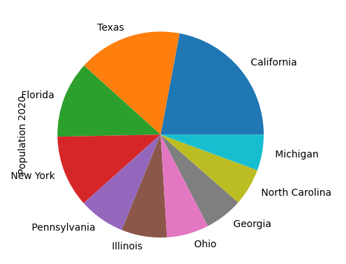
Pie Charts are another helpful chart to visually see which members are the biggest piece of the pie.
import pandas as pd
df = pd.read_excel('us_population_change_2020.xlsx')
df = df.head(10)
df.plot(kind='pie', y='Population 2020', labels=df['State'].tolist(), legend=False)
Explanation:
We’ll stick with the top 10 states by population, then in the df.plot() function, note that we’re specifying “kind = ‘pie’ “ since we’d like a pie chart. The labels will take the values from the State column in Excel and convert that column into a list, as an easy way to ensure the pie chart has the right corresponding column names.
