IN THIS LESSON
Python Line Charts
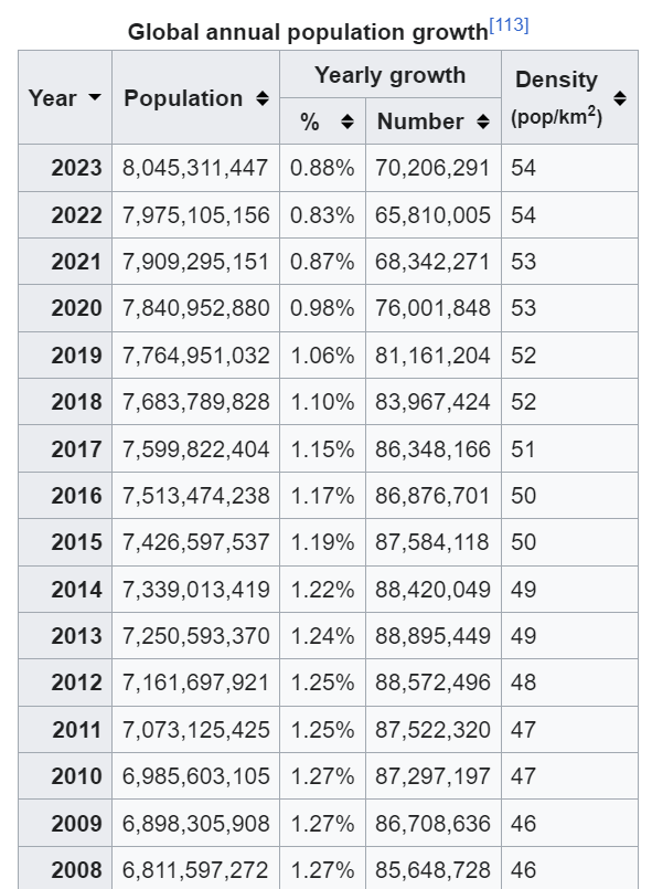
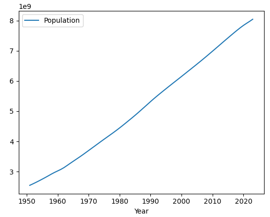
Graphing in Python is very simple, we can create our first chart with only 4 lines of code from an Excel file. We’ll import an Excel file with world population growth from Wikipedia below, and create a Line Chart plotting the world population since 1954. (https://en.wikipedia.org/wiki/World_population)
Code:
import pandas as pd
df = pd.read_excel('world_population_growth.xlsx')
df.plot( 'Year' , 'Population' )
Explanation:
The first line imports the pandas module to import and plot the data with built-in functionality. The second line reads in the world_population_growth.xlsx file taken from the Wikipedia page above and the final line actually creates a plot in the screenshot above in the jupyter notebook, telling the function to plot the “Year” column on the x axis and the “Population” column on the y axis. The formatting of the y axis is automatically applied to show a single number representing billions, and we’ll see in future lessons how to further edit the graph with customizations.
-
Add a short summary or a list of helpful resources here.

