Python Charts
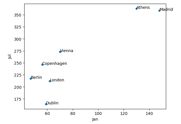
Let’s add labels to the scatter plot for easier interpretation.
import pandas as pd
df = pd.read_excel('europe_cities_by_sunshine.xlsx')
df = df[df['City'].isin(['Vienna','London','Zurich','Copenhagen','Athens', 'Madrid','Dublin', 'Berlin'])]
ax = df.plot(kind='scatter', x='Jan', y='Jul')
for idx, row in df.iterrows():
ax.annotate(row['City'], (row['Jan'], row['Jul']))
Explanation:
Now, the last two rows will go through the dataframe of data we just plotted, and annotate on the graph the city name (taking it from the specific row’s “row['City’]” element, and plotting it at the x and y location, respectively, of that specific city’s Jan and Jul data values. So for Dublin for ex, it will look at Dublin’s row and plot the word “Dublin” at (60, 175) because that’s where Dublin’s Jan and Jul data correspond to.
