Graphing Charts in Python
Python Charts
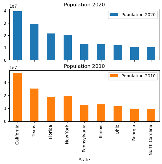
We can plot the 2010 and 2020 data in 2 separate charts as yet another way to visualize this data:
import pandas as pd
df = pd.read_excel('us_population_change_2020.xlsx')
ax = df.plot.bar(x="State", y=["Population 2020", "Population 2010"], stacked=True, subplots=True)
Explanation:
Now, we’ve added the “subplots= True” parameter to instruct Python to plot the 2 data series in 2 separate charts, with the x axes on top of each other so it’s easy to see California on top vs the bottom, for ex.
