Graphing Charts in Python
Python Charts
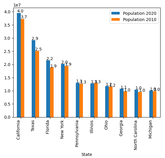
Now let’s save this bar chart
import pandas as pd
df = pd.read_excel('us_population_change_2020.xlsx')
df = df.head(10)
ax = df.plot(x="State", y=["Population 2020", "Population 2010"], kind="bar")
ax.set_xticklabels(ax.get_xticklabels(), rotation=90, ha='right')
for p in ax.patches:
ax.annotate(str(round(p.get_height()/10000000, 1)), (p.get_x() * 1.005, p.get_height() * 1.005))
ax.figure.savefig('topStatesPopulationChange.png')
Explanation:
The last line is the savefig function that will save the png file locally in your python directory, so you can easily send it or deal with it in various functions.
