Graphing Charts in Python
Python Charts
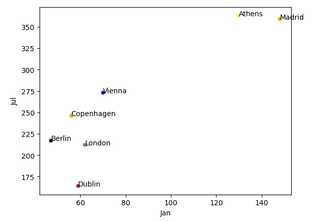
Now let’s add colors to the scatter plot
import pandas as pd
df = pd.read_excel('europe_cities_by_sunshine.xlsx')
df = df[df['City'].isin(['Vienna','London','Zurich','Copenhagen','Athens', 'Madrid','Dublin', 'Berlin'])]
colors = ['blue','orange','black','yellow','brown','orange','gray']
ax = df.plot(kind='scatter', x='Jan', y='Jul', c= colors )
for idx, row in df.iterrows():
ax.annotate(row['City'], (row['Jan'], row['Jul']))
Explanation:
The df.plot() function now takes in a “c = colors” parameter, where colors is a list of colors we’re going to assign to the dataframe for each specific city. See how the order of colors corresponds to the list of cities, so the first color (blue) maps with Vienna.
