Python Line Charts
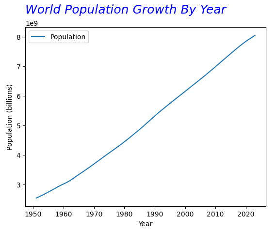
There’s countless customizations we can make to our title:
Code:
import pandas as pd
df = pd.read_excel('world_population_growth.xlsx')
df.plot( 'Year' , 'Population' )
plt.xlabel('Year')
plt.ylabel('Population (billions)')
plt.title('World Population Growth By Year')
plt.title('World Population Growth By Year', fontsize=18, color="blue", pad = 10, loc="left", fontstyle='italic')
Explanation:
We’re using the same plt.title() function and passing several more parameters we’d like to include.
Fontsize is the size of text for the title
The color can be specified from here (https://matplotlib.org/stable/gallery/color/named_colors.html)
Pad is how much extra space above the top of the chart you’d like to add (so raising it to 100 would add more space in between the top of the chart and the bottom)
Loc is where you’d like the title to be set, similar to Microsoft Word’s alignment to the left/right/center
Fontstyle is similar to Word’s italic as well
-
Add a short summary or a list of helpful resources here.
