Python Charts
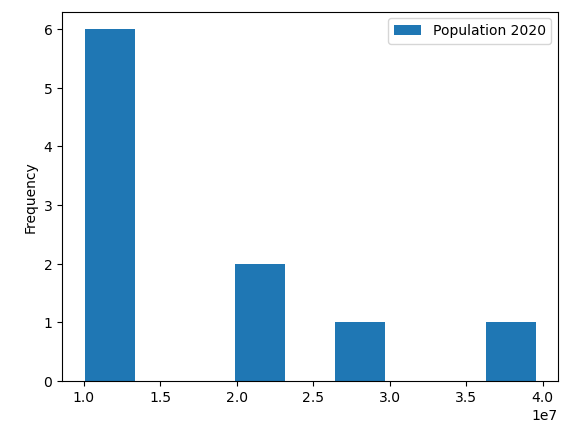
Histograms are valuable charts to see frequency within a dataset, and are simple to plot in Python:
import pandas as pd
df = pd.read_excel('us_population_change_2020.xlsx')
df = df[['State', 'Population 2020']]
df = df.head(10)
ax = df.plot.hist(bins=9)
Explanation:
Note that in the 2nd line, we’re only going to use columns with the State’s name and its Population from 2020. The 3rd line plots the histogram for the top 10 states of data, and the histogram will bucket the Population into several “bins” or buckets, and the higher the graph for a bin, the more frequent that population figure was represented in the data. For ex, the rightmost bar is 1 unit high, since only California has a population above 39 million. On the other hand, there are 6 states in the top 10 that have a population between 10 to 15 million, accounting for the leftmost bar’s height of 6.
