Graphing Charts in Python
IN THIS LESSON
Python Line Charts
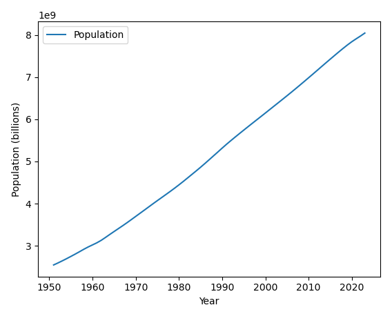
Adding x and y labels are very simple — see the code below to make your chart clearer to understand.
Code:
import pandas as pd
df = pd.read_excel('world_population_growth.xlsx')
df.plot( 'Year' , 'Population' )
plt.xlabel('Year')
plt.ylabel('Population (billions)')
Explanation:
The plt.ylabel(‘Population (billions)’) is what to place on the y axis — you can enter anything you’d like in the plt.ylabel() function and it’ll appear in the chart.
-
Add a short summary or a list of helpful resources here.
