Python Charts
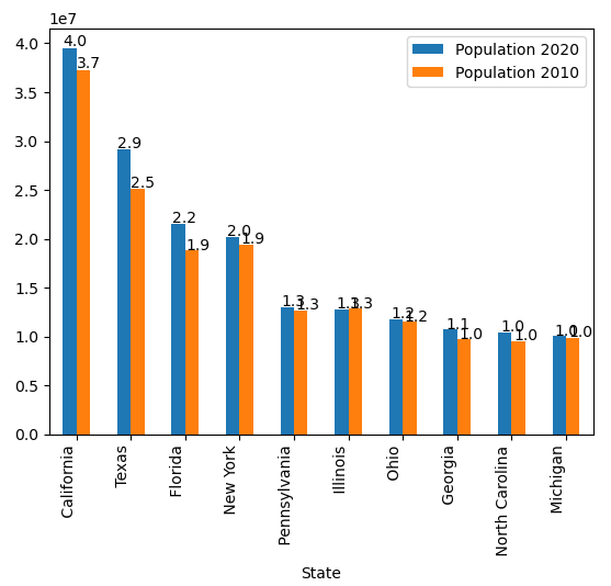
Say we’d like to compare the Population in 2010 vs 2020 for the top US cities:
import pandas as pd
df = pd.read_excel('us_population_change_2020.xlsx')
df = df.head(10)
ax = df.plot(x="State", y=["Population 2020", "Population 2010"], kind="bar")
ax.set_xticklabels(ax.get_xticklabels(), rotation=90, ha='right')
for p in ax.patches:
ax.annotate(str(round(p.get_height()/10000000, 1)), (p.get_x() * 1.005, p.get_height() * 1.005))
Explanation:
Now, the last 3 lines are going to add the labels from the prior chart. First, it’ll add X labels to the X axis and the “for p in ax.patches” line will go through all available bars in the bar chart, and “annotate” these bar charts with the actual values from the chart. The ax.annotate function will draw on the graph and the values will be the “p.getheight()” and “p.get_x()” values as the y and x values, respectively. These are in-built functions in Python to get the bar chart’s values and use them in the code. The rest of the code is just formatting these values by rounding it and converting it to a string.
