Python Charts
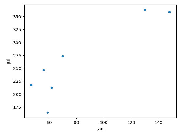
The scatter plot is a common chart to display data across two axes and see trends.
import pandas as pd
df = pd.read_excel('europe_cities_by_sunshine.xlsx')
df = df[df['City'].isin(['Vienna','London','Zurich','Copenhagen','Athens', 'Madrid','Dublin', 'Berlin'])]
ax = df.plot(kind='scatter', x='Jan', y='Jul')
Explanation:
Note we’ll be using the Europe cities by sunshine Excel sheet, ranking each city by how much sunshine it receives each month and in the total year. The 3rd line is similar to the Filter function in Excel, where out of all Europe cities, it says to only include Vienna, London, Zurich, etc. The final line actually plots the scatter plot with the x axis representing the amount of sunshine received in January, while the y axis is the same for the month of July. We’ll see in future lessons how to make these charts easier to understand with labels, etc.
