Graphing Charts in Python
Python Charts
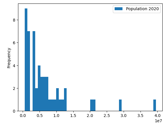
Now let’s include more data to see how the histogram would look:
import pandas as pd
df = pd.read_excel('us_population_change_2020.xlsx')
df = df[['State', 'Population 2020']]
ax = df.plot.hist(bins=50)
Explanation:
We can see within the top 50 states, the majority of states have a population under 10 million residents. We specified “bins = 50” to break down this into 50 bins, we could also set bins = 1 and there would be 1 single bar with a height of 50, since that would encompass the entirety of all 50 states.
