Graphing Charts in Python
Python Charts
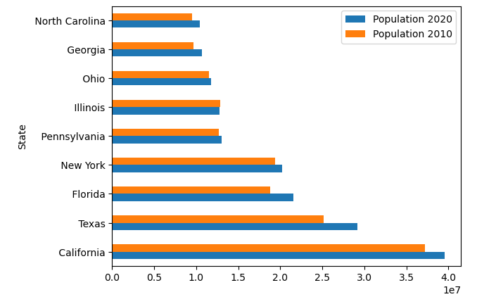
Now let’s see how with one character change, we can plot everything horizontally vs vertically, by default:
import pandas as pd
df = pd.read_excel('us_population_change_2020.xlsx')
ax = df.plot.barh(x="State", y=["Population 2020", "Population 2010"])
Explanation:
By simply changing the graphing function to “.barh”, the chart will now be graphed horizontally, showing how easy it is to switch directions in Python.
